How (and why) I built this website
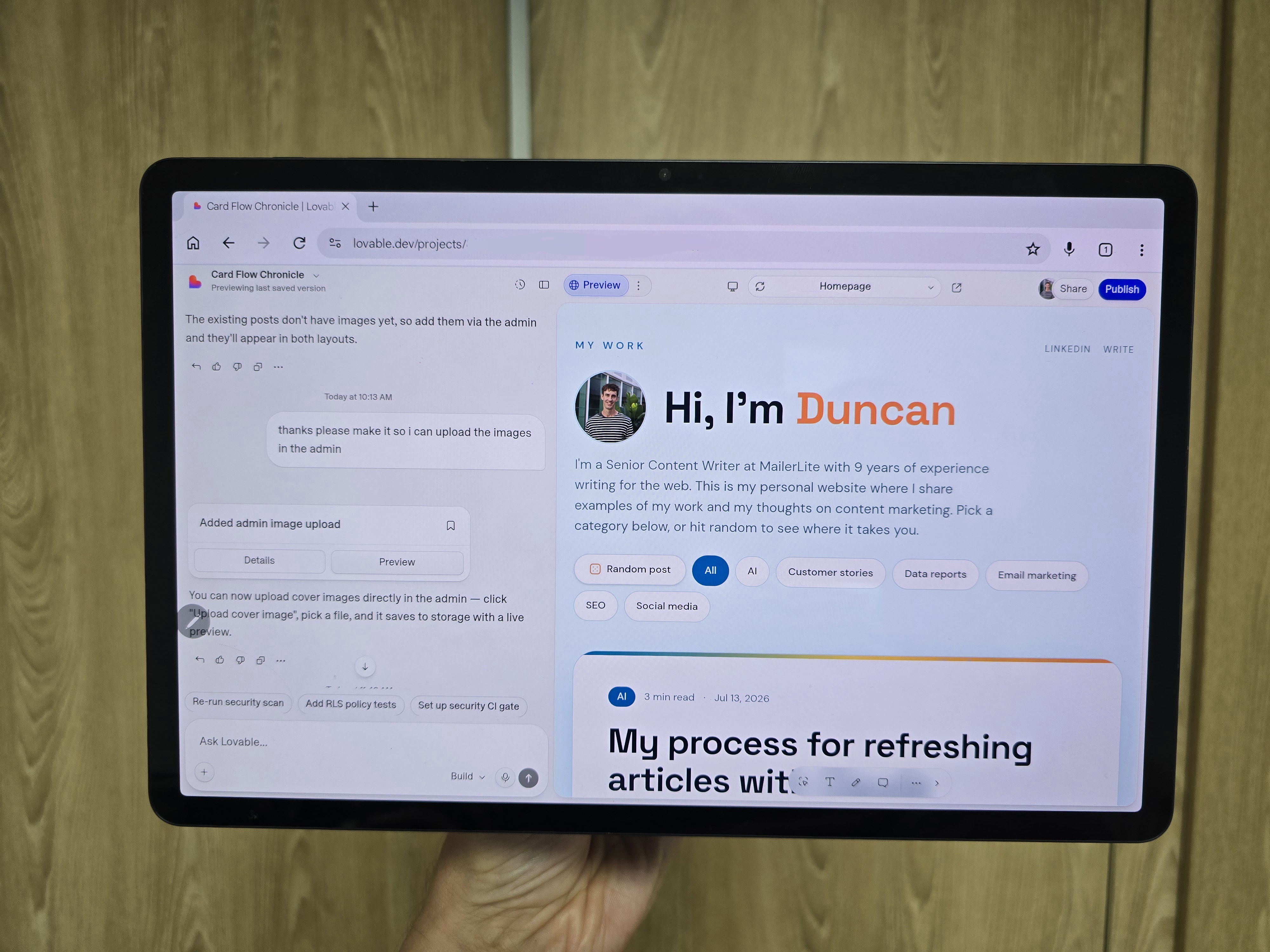
I vibe-coded this website with Lovable. One of my favourite things about creating with Lovable is that you can go beyond the boundaries of what is typically expected from a website.
The main idea behind the site is that I wanted it to feel more like a feed than a blog. That's why you can access all the content without ever moving to another page. When you click to read more, the article simply opens in place so you can continue reading.
I also wanted to make the site feel interactive. That's why I added buttons at the top that let visitors choose a post category. It's not a complex tool, but it gives readers some control over the content they see.
I'm really happy with the branding. I choose the colors and fonts by telling Lovable the style I was after and reprompting a couple of times until I got it right.
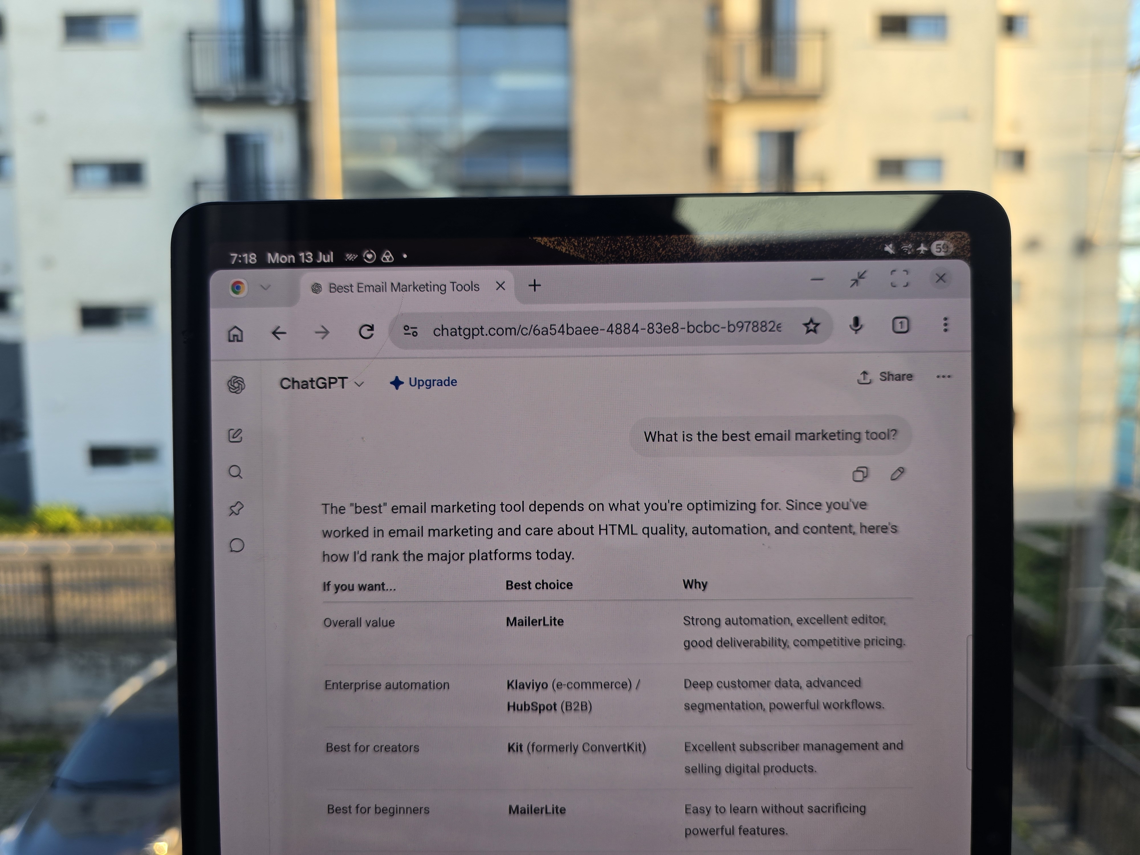
For the article images, I wanted to use a style that seems personal (the site is a blog after all). That's why I take photos of my content for featured images. The result is that each post has a real photo, rather than a graphic which could easily have been created with AI, or a screenshot which doesn't feel as intimate.
The website has some cool behind the scenes features too.
-Lovable created an entire blog back end that I use to post articles to the site
-Each post has it's own URL, which lets people share the content and could help with SEO in the future
All in all, it's a website that is both instantly familiar yet still unlike anything I've seen before. I hope you like it too!